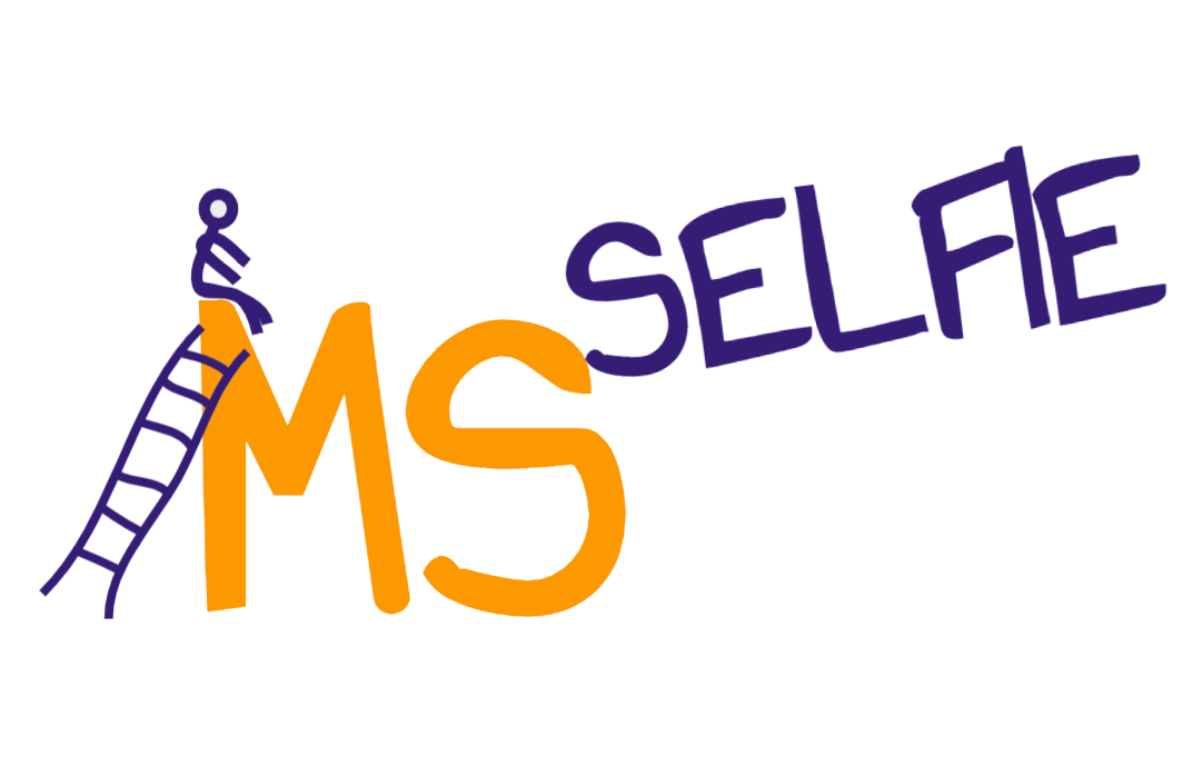
I am trying to create a logo for the MS-Selfie Newsletter. This is my first attempt what do you think? Does the self-help philosophy behind what we are trying to do here come out in the image? Thanks.
I have now added a variation to the design. The person with MS is now pulling themselves up to overcome MS. This is more active. I have also given you a softer version of the colour. Is this better? Thanks for your help on this.
I far prefer version 1.0 - all the elements balance a lot better and I personally think the little person is quite chilled on top of the M. I’m not mad on the dotted lines on the others as it overcomplicates the design. Your first choice of colours are great as they’re complementary and really pop together. I think whatever you do decide you won’t please everyone as we all have different experiences and views on MS but overall the original design definitely works. You could try the little person in version 1.0 but with their hands in the air - that would provide an active element without over complicating things. Good luck 😊
Colour combo is spot on. I work as a designer and really like it. I like the child-like accessible vibe it gives off. I even like the wobbly ladder 😂 I saw some people said they think that’s not positive but in my mind it shows that there are ups and downs in life and that isn’t unique to MS at all. Despite all that the little person has climbed the ladder and made it to the top and that sends an incredible powerful message. You could play around with the little person a bit based on what people have been saying here. Maybe change the M font slightly so that the first point leads into a more gentle drop. Personally speaking though I love it. It’s fun, accessible and most importantly empowering
Nice and simple with colours on the opposite side of the colour wheel (vip) and slightly wobbly graphics like “Roobarb”. You may have future in advertising.
Self-help is important but don’t let the MDs, allieds and governments off the hook. We can’t self-assist without frequent or even constant, access to the kind of knowledge only professionals have - or would have, if research into symptom management were anywhere near as advanced and well funded as investigation of DMTs and pathogenesis.
Where is the OT perched on my shoulder giving me advice on the 40-50 choices I have to make every day about movement, risk, assistive devices, drugs, counselling, scheduling, cost of interventions, accessibility of the built environment, personal protective equipment, social distancing, caregivers, relationships and more, all under conditions of fatigue and cognitive stress? Because the annual or semi-annual neuro consult doesn’t come close.
ProfG, I very much appreciate your concern for the real-time lived lives of pwMS, and your willingness to indulge your creative side in public. However, my personal take on this image is that it underscores the extent to which pwMS ascend their ladders alone. Also, where are the snakes?
I am probably overthinking this but the snakes and ladder connotations make me want the stick person to get the ladder from the top of the big S to the safety of the Selfie. Thus avoiding a descent down the snake! 😬😆
Good doodle but I don't like the colours. I find the whole dark orange ms society colour really depressing. The equivalent website in France is really up and bright. I think it makes quite a difference.
I prefer no 1 although the colour reminds me of the regular MS Society newsletter. What about those who don’t have a hope of climbing up any sort of ladder?
I like angle that the word 'selfie' is in the later versions, somehow more pleasing to the eye. I also prefer the stick person's pose in v1; later versions he/she looks like they're falling backwards. I've always disliked the orange that's associated with MS, not sure whether you can get away from it?
Color Pantone is great. Those are colors that are (I think) more color blind friendly. Green is likely not a good option for those that are color blind, most have red-green issues. I learned that the hard way when designing an infusion order entry app in an EHR
It is great you are attempting to design a logo for this, I run research projects and find it very hard to come up with logos which convey the project (the PI normally has the most input). We have found the best designer who takes the logos to the next level. She is a Comms person for a large research grant. I don't know if you have funds for logo design (they are costed into our projects as a necessity). Examples (and interesting research projects as well) www.cusp.ac.uk
Very nice. I am raising money via subscriptions for case studies to being a medical writer on board. This project is really only starting and starting small and slowly as I gradually build content and gather readers. I don't want to be seen wasting money on designers at this stage.
The other aspect of that I need to convey is that it needs to feel a bit DIYish. i.e. this is to encourage pwMS to do it themselves and not necessarily rely on costly professionals.
May I am being naive and foolish, but I am going to give it a go.
Totally understand that funds on a logo sometimes feels excessive, thing is with the feedback here you have done most of the work. And the comment above is a 'brief' that they could work with. On the funding note, I see that St Parts/QM's has an IAA. Have you considered talking to them. https://www.qmul.ac.uk/research/research-impact/iaa/ We have one at Surrey University and this is the kind of 'network'/project that would fit the remit. It has the potential to deliver impact (the favoured word of University Senior Management). From our account I know its a discussion with the manager, then complete a standard form (very uncomplicated, to avoid people being put off). You create a budget - it could be for your Medical Writer (for a year say) and Graphic Designer, web hosting etc. Seedcorn money with a view to self reliance on subscriptions after these funds are utilised. This would need QM research to be built on? Sorry.... may be telling you things you all ready know. Apologies.
I like design 1.0. Colour is good, person sitting forward as if they are ready to get on with whatever is good. The other two look slightly like the person is about to fall.
Version 2.1. love the ladder, as that's how I feel each day when I'm trying to do or accomplish something (or anything lol) I also liked the little person resting, and feeling tall and proud that shes made it (ready for another day). It's a positive logo 😁
I like version 1.0 the best as it seems more positive. Maybe you could add more stick figures, one pushing, one pulling, one holding up the middle of the M etc. as we all handle and support ourselves/others differently!
I like the proportion of the individual next to the monumental MS – and the "handmade" look of the ladder! I wonder if there is any way to position the word selfie as if it is a smaller heavy object the figure is trying to push or heave up so it's "on top" - of the MS, or moving in that direction anyway - while still being immediately legible?
If I were the designer I'd want the MS in more certain, definite letters and the "selfie" to be a bit smaller and more - as it is - hand drawn, to suggest the idiosyncratic, uncertain experience of being a pwMS.
Not sure whether that would make intuitive sense to anybody else!
Love the colors. The ladder appears to be “rickity rackety” and where it is understood that this is the difficulty for some MS patients who have progressed, it is depressing to point it out.
How about portraying positivity about all of the possibilities that now exist to halt disability progression? Sure would allow one to know that there is a reason for our positive attitude in order to care for one’s self.
Hi Prof G - you really do mix your breakfast morn up a bit! I like the ladder & MS could be a stronger more defined font. I also like the other comments that the stick person should have a more positive & happy stance. With the selfie going up at an angle with a group of arms ready to support & manage.
I really like it and it feels positive and connects with me as a pwms. From a design POV my only thought was does the font style combined with the stick person possibly give more child/play connotations?
I like the doodle nature as it reflects the imperfect nature. The perched on top reflects the precariousness of it all. Drop the word selfie to the bottom and not high up as it is at present.
I understand what you and Adam are saying. I am commenting from the visual layout type thing. To me, the stickman ought to be the focus. They have ascended the wobbly and uncertain ladder, are perched at the top trying to stay there and that is the focus. MSselfie is the brand. Unless you are going to elevate the word selfie to this upper position elsewhere then I think iy doesn't reflect it and draws the eye from the achievements and precariousness of the stick figure.
Still - all intensely personal. just my two-penneth worth. Whatever you do, more power to your elbow and thank you for your efforts. I (and many others) appreciate them.
I agree with your first two points Dominic but I think the elevated position of Selfie stands out because it puts the stick figure on the same level as the sense of self-driven help with, crucially, both prioritised above the disease. We as pwMS (see, even in that term 'pwMS' :-)) are so often faced with that looming pair of capital letters used to define us and it is nice to see in this doodle the concept of the person and their own efforts being elevated above the disease signifier. I did wonder if the ladder image might put off people with less mobility, although I like its wobbly and uneven nature. But I appreciate that I don't speak for those people.
Oh true. You're thinking more about the process and power of information, I was thinking about patient's journey. But a good picture has many different interpretations.
I like version one, they’ve climbed up the ladder (positive message) but could they fall off, good analogy to living with MS.
The other ones they look too wobbly balanced & the green colour is not as effective. I like the mustard colour, this maybe ingrained because of MS Society logo colours?
Thanks for all your newsletters, I learned so much & find I will read a snapshot, more than a bigger MS charity magazine which I find overwhelming. 😊


I have now added a variation to the design. The person with MS is now pulling themselves up to overcome MS. This is more active. I have also given you a softer version of the colour. Is this better? Thanks for your help on this.
I far prefer version 1.0 - all the elements balance a lot better and I personally think the little person is quite chilled on top of the M. I’m not mad on the dotted lines on the others as it overcomplicates the design. Your first choice of colours are great as they’re complementary and really pop together. I think whatever you do decide you won’t please everyone as we all have different experiences and views on MS but overall the original design definitely works. You could try the little person in version 1.0 but with their hands in the air - that would provide an active element without over complicating things. Good luck 😊
Colour combo is spot on. I work as a designer and really like it. I like the child-like accessible vibe it gives off. I even like the wobbly ladder 😂 I saw some people said they think that’s not positive but in my mind it shows that there are ups and downs in life and that isn’t unique to MS at all. Despite all that the little person has climbed the ladder and made it to the top and that sends an incredible powerful message. You could play around with the little person a bit based on what people have been saying here. Maybe change the M font slightly so that the first point leads into a more gentle drop. Personally speaking though I love it. It’s fun, accessible and most importantly empowering
Definitely wouldn’t be me climbing the ladder! 😆
Nice and simple with colours on the opposite side of the colour wheel (vip) and slightly wobbly graphics like “Roobarb”. You may have future in advertising.
Like it except for the orange which suggests (to me anyway) an association with the MS Society.
Yes. Orange is the colour of MS. Should I change it?
I don't think so. The colour combo is excellent.
I think so. It is good to see it (MS Selfie) as something fresh, independent and not involved with the likes of the MS Society.
Self-help is important but don’t let the MDs, allieds and governments off the hook. We can’t self-assist without frequent or even constant, access to the kind of knowledge only professionals have - or would have, if research into symptom management were anywhere near as advanced and well funded as investigation of DMTs and pathogenesis.
Where is the OT perched on my shoulder giving me advice on the 40-50 choices I have to make every day about movement, risk, assistive devices, drugs, counselling, scheduling, cost of interventions, accessibility of the built environment, personal protective equipment, social distancing, caregivers, relationships and more, all under conditions of fatigue and cognitive stress? Because the annual or semi-annual neuro consult doesn’t come close.
ProfG, I very much appreciate your concern for the real-time lived lives of pwMS, and your willingness to indulge your creative side in public. However, my personal take on this image is that it underscores the extent to which pwMS ascend their ladders alone. Also, where are the snakes?
Snakes a good point
I am probably overthinking this but the snakes and ladder connotations make me want the stick person to get the ladder from the top of the big S to the safety of the Selfie. Thus avoiding a descent down the snake! 😬😆
You beat me to it!
Would raise the arms of the little person to show he/she is happy and proud of being on top of it! Love it!
Good idea
Version 1.0
Definately version 1
Good doodle but I don't like the colours. I find the whole dark orange ms society colour really depressing. The equivalent website in France is really up and bright. I think it makes quite a difference.
I prefer no 1 although the colour reminds me of the regular MS Society newsletter. What about those who don’t have a hope of climbing up any sort of ladder?
I like version 1.0 but some days you cannot make it too the top of the ladder but that’s ok.
I like version -1.0. Selfie has a more positive slant.
I'm not sure you're going to please everybody!
I like angle that the word 'selfie' is in the later versions, somehow more pleasing to the eye. I also prefer the stick person's pose in v1; later versions he/she looks like they're falling backwards. I've always disliked the orange that's associated with MS, not sure whether you can get away from it?
1.0 = perfect! I looked at it and felt hope.
Color Pantone is great. Those are colors that are (I think) more color blind friendly. Green is likely not a good option for those that are color blind, most have red-green issues. I learned that the hard way when designing an infusion order entry app in an EHR
It is great you are attempting to design a logo for this, I run research projects and find it very hard to come up with logos which convey the project (the PI normally has the most input). We have found the best designer who takes the logos to the next level. She is a Comms person for a large research grant. I don't know if you have funds for logo design (they are costed into our projects as a necessity). Examples (and interesting research projects as well) www.cusp.ac.uk
and www.anticipate.ac.uk
Very nice. I am raising money via subscriptions for case studies to being a medical writer on board. This project is really only starting and starting small and slowly as I gradually build content and gather readers. I don't want to be seen wasting money on designers at this stage.
The other aspect of that I need to convey is that it needs to feel a bit DIYish. i.e. this is to encourage pwMS to do it themselves and not necessarily rely on costly professionals.
May I am being naive and foolish, but I am going to give it a go.
Totally understand that funds on a logo sometimes feels excessive, thing is with the feedback here you have done most of the work. And the comment above is a 'brief' that they could work with. On the funding note, I see that St Parts/QM's has an IAA. Have you considered talking to them. https://www.qmul.ac.uk/research/research-impact/iaa/ We have one at Surrey University and this is the kind of 'network'/project that would fit the remit. It has the potential to deliver impact (the favoured word of University Senior Management). From our account I know its a discussion with the manager, then complete a standard form (very uncomplicated, to avoid people being put off). You create a budget - it could be for your Medical Writer (for a year say) and Graphic Designer, web hosting etc. Seedcorn money with a view to self reliance on subscriptions after these funds are utilised. This would need QM research to be built on? Sorry.... may be telling you things you all ready know. Apologies.
I prefer version 1.0
Me to.
I like design 1.0. Colour is good, person sitting forward as if they are ready to get on with whatever is good. The other two look slightly like the person is about to fall.
Version 2.1. love the ladder, as that's how I feel each day when I'm trying to do or accomplish something (or anything lol) I also liked the little person resting, and feeling tall and proud that shes made it (ready for another day). It's a positive logo 😁
Or someone holding the ladder!
I like version 1.0 the best as it seems more positive. Maybe you could add more stick figures, one pushing, one pulling, one holding up the middle of the M etc. as we all handle and support ourselves/others differently!
I love it! I like the green MS, but the aspect of selfie in version 1.0. Also like the 'happier' looking person best.
I like the proportion of the individual next to the monumental MS – and the "handmade" look of the ladder! I wonder if there is any way to position the word selfie as if it is a smaller heavy object the figure is trying to push or heave up so it's "on top" - of the MS, or moving in that direction anyway - while still being immediately legible?
If I were the designer I'd want the MS in more certain, definite letters and the "selfie" to be a bit smaller and more - as it is - hand drawn, to suggest the idiosyncratic, uncertain experience of being a pwMS.
Not sure whether that would make intuitive sense to anybody else!
How about linking the MS with the Selfie by using the M"S" as the first letter of Selfie eg MSelfie?
Like the MSer sitting on the top of MS but having to get there by a wonky ladder.
Visually I like it, but my mind immediately thought “overcoming MS.”
Love it 😁 (especially like that the person is on top of MS!)
Love the colors. The ladder appears to be “rickity rackety” and where it is understood that this is the difficulty for some MS patients who have progressed, it is depressing to point it out.
How about portraying positivity about all of the possibilities that now exist to halt disability progression? Sure would allow one to know that there is a reason for our positive attitude in order to care for one’s self.
Simple and creative 👌
Hi Prof G - you really do mix your breakfast morn up a bit! I like the ladder & MS could be a stronger more defined font. I also like the other comments that the stick person should have a more positive & happy stance. With the selfie going up at an angle with a group of arms ready to support & manage.
I like it😃, though that ladder looks very unsafe.
I really like it and it feels positive and connects with me as a pwms. From a design POV my only thought was does the font style combined with the stick person possibly give more child/play connotations?
The font is meant to be non professional to give it a DIY feel, i.e. a self-help.
Yes, it's brilliant 🙂
Love it
It’s great, with a couple of tweaks mentioned in other comments, it’s going to be perfect!
Love it
I like the doodle nature as it reflects the imperfect nature. The perched on top reflects the precariousness of it all. Drop the word selfie to the bottom and not high up as it is at present.
I wanted the selfie to be above MS to indicate that you yourself get on top of MS
I understand what you and Adam are saying. I am commenting from the visual layout type thing. To me, the stickman ought to be the focus. They have ascended the wobbly and uncertain ladder, are perched at the top trying to stay there and that is the focus. MSselfie is the brand. Unless you are going to elevate the word selfie to this upper position elsewhere then I think iy doesn't reflect it and draws the eye from the achievements and precariousness of the stick figure.
Still - all intensely personal. just my two-penneth worth. Whatever you do, more power to your elbow and thank you for your efforts. I (and many others) appreciate them.
Your comment appeared while I was writing mine and I only just saw it on posting. Thank you; I like your line of thought.
I agree with your first two points Dominic but I think the elevated position of Selfie stands out because it puts the stick figure on the same level as the sense of self-driven help with, crucially, both prioritised above the disease. We as pwMS (see, even in that term 'pwMS' :-)) are so often faced with that looming pair of capital letters used to define us and it is nice to see in this doodle the concept of the person and their own efforts being elevated above the disease signifier. I did wonder if the ladder image might put off people with less mobility, although I like its wobbly and uneven nature. But I appreciate that I don't speak for those people.
Like it a lot, the ladder says it all. And conquering the bladdy disease, or at least being on top of it, not under.
Thanks. The ladder represents learning and effort. The climb or rungs represents incremental increase in knowledge.
Oh true. You're thinking more about the process and power of information, I was thinking about patient's journey. But a good picture has many different interpretations.
👍like it
Looks good to me
👍
I like version one, they’ve climbed up the ladder (positive message) but could they fall off, good analogy to living with MS.
The other ones they look too wobbly balanced & the green colour is not as effective. I like the mustard colour, this maybe ingrained because of MS Society logo colours?
Thanks for all your newsletters, I learned so much & find I will read a snapshot, more than a bigger MS charity magazine which I find overwhelming. 😊